


Business Card Design Trends in 2026: Where Print Meets Digital Innovation
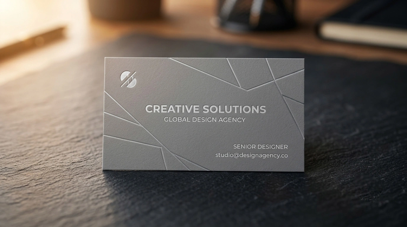
Despite the growth in online business, the growth of the business card has come as a major surprise. While everyone debated the dying condition of print, business cards have survived the onslaught. People even argue that a LinkedIn QR Code is the future in today’s professional world. However, even in 2026, the card is still not considered obsolete, since digital platforms cannot overcome the impact business cards usually create.
Why Data Behind the Comeback?
Digital marketing owns the casual exchanges, and this is what everyone needs to pay attention to. These include conference app connect and quick LinkedIn add. But there is no replacement for physical media when the stakes are doubled.
76% of professionals say a memorable physical card has directly helped open a business or career opportunity.
The global custom-printed business card market continues to grow steadily, even as digital-first networking expands alongside it.
Put simply: print isn’t shrinking. It’s specializing. The card that survives 2026 isn’t the one printed in bulk and forgotten in a drawer — it’s the one built to be kept. That single distinction is what separates this year’s best design trends from last decade’s default template. Here’s how the strongest brands are executing it.
Key Design Trends
Metal-Industrial Designs: Strength Meets Sophistication
Brushed-metal textures, geometric structures, and architectural layouts are having a moment — and most of them aren’t actually metal. Rather than making the cards completely out of metals such as silver, champagne gold, and gunmetal foil, the card design will be done by using the foil effect on the cards together with metallic ink and fonts. For instance, the security brand can opt for the gray card with brushed steel finish and silver foiled logo.
Most appropriate for: Architecture firms, technology brands, manufacturing industries, and security brands. Design Rule: Restraint is everything. Stack too many metallic effects and the card stops looking premium — it starts looking like it’s trying too hard.
Window-Pane Cards: Transparency as a Brand Statement
If metal signals weight, transparency signals confidence. Clear PVC and frosted stocks are emerging as one of 2026’s most futuristic print directions, using layered depth and negative space instead of ink alone. Picture a creative agency’s card where contact details appear to float behind a bold logo — the visual shifting depending on whatever surface sits behind it. It’s a genuinely different experience every time it’s handed over.
The Trade-Off: Transparency kills natural contrast, so typographic hierarchy has to be airtight to stay legible under normal lighting.
Collectible Cards: Turning Networking Into an Experience
Not every trend is about materials — some are about psychology. A collectible business card solves just one issue: no one keeps a card that’s meant to be thrown away. The creative director could produce a limited edition of five cards, each card representing a different visual design (such as 03/05). Illustrators take it further with mini art-print cards — original artwork on the front, a clean logo and QR code on the back. The recipient isn’t holding a contact slip anymore. They’re holding something worth pinning to a corkboard.
Hyper-Minimalism: Less Information, More Confidence
Minimalism in 2026 has moved past “clean white space” into something closer to blank-canvas confidence — an oversized monogram or logo commanding one full side, with contact details reduced to precise, micro-typography on the reverse. This is where material quality quietly does the heavy lifting. Consumer research from packaging and print studies shows over 70% of buyers prioritize sustainable paper narratives and tactile weight — and cards printed on heavy, premium stock (450gsm+ FSC-certified paper, for example) get retained significantly longer simply because the heft feels permanent.
Design Rule: Minimalism has no margin for error. A card this stripped-down either reads as high-end or looks unfinished — there’s no in-between, and weak spacing or low contrast is what tips it the wrong way.
Functional and Material Innovations
Tactile Finishes: Making Print Physically Memorable
If minimalism handles the visual first impression, tactile finishes handle the physical one. In a digital-first world, touch has become a genuine psychological anchor — which is why specialty finishes are showing up everywhere: spot UV gloss against matte laminate, blind debossing (pressed detail with no ink at all), and heavy colored cotton stocks. The goal isn’t decoration. It’s sensory contrast — making sure the handover engages sight and touch at the same moment.
Sustainable Materials: Part of the Story, Not a Footnote
That same tactile instinct is now colliding with a bigger shift: sustainability has moved from afterthought to core material decision. Market studies show over 70% of consumers treat recyclable packaging and paper-based claims as a real factor in purchasing decisions — and that preference is pulling FSC-certified stocks, recycled composites, and post-consumer cotton into the mainstream.
Niche options like seed paper still have their place for event giveaways or eco-campaigns, but most everyday businesses are opting for clean, recycled, or locally sourced stock instead. The strongest sustainable designs don’t lean on a generic “eco-friendly” badge to make the point — the texture and finish of the paper do that work on its own.
QR Codes and the Hybrid Networking Model
All of this — the metal, the minimalism, the tactile finishes — still has to connect to the digital world somehow. That integration has finally matured past gimmick territory.
QR code adoption on printed cards has reached roughly 36%, outperforming NFC (around 14%, still limited by hardware compatibility).
57% of users want easy contact saving.
56% value the ability to update their information after the card’s already printed.
To execute this well in 2026:
Use dynamic QR links. Never encode static details directly into the QR pattern — a dynamic link lets you update a portfolio, phone number, or booking page without reprinting an entire batch.
Build a hybrid layout. Keep the front clean — name, title, WhatsApp or phone, location — and place a discreet, functional QR code on the back, linking directly to a mobile vCard or live portfolio.
Designing the Business Card of the Future
Every trend above points to the same conclusion: print isn’t dying; it’s getting deliberate. The 2026 sweet spot is a premium-minimal card on recycled or FSC-certified stock, paired with a dynamic QR vCard on the back. That combination covers every base at once — the tactile handover people remember, the instant digital sync people expect, and the reduced-waste, short-run printing that sustainability-conscious brands now require. The materials, the visual language, the interactive layer — none of it should be chosen because it’s trending. Choose what actually matches the brand behind the card, and make every square inch earn its place.